A mark for the shop that stands behind the stitch.
This is the visual system for the network brand — distinct from americanupholstery.com, built to carry the trust of a network of vetted shops rather than one. Modern and trustworthy first; craft shows up in the detail, not the decoration.
Augmented, not artificial.
Upholsterers United isn't an AI company running the shop floor — it's about being augmented: a highly fragmented trade (thousands of independent upholstery shops, each capable but isolated) made stronger by technology that connects them, without replacing the craftsperson actually doing the work. The three marks below explore that idea visually — none of them replace the shield mark below yet; they're here to react to.
A. Three panels, one shield
Two stitched seams instead of one divide the shield into three facets — many independent shops, assembled into a single mark. Closest relative of the current mark.
B. Three nodes, one network
Reads as the letter A and as a network diagram at once — three shop-nodes, tied together by a stitched crossbar instead of a data line.
C. The same shield, with an echo
Lowest-risk option: the existing shield, unchanged, with a faint second outline trailing it — technology as an added layer behind the original craft mark, not a replacement for it.
C, pushed further — more material, more depth
Same silhouette, rendered with the weight it would actually carry on a shop door or a payout card: a gradient instead of a flat fill, a catch-light like light hitting pressed leather or brushed metal, and a stitch with its own tiny shadow instead of a flat dashed line — closer to a rendered badge than a flat icon, without tipping into a literal photo.
Still SVG, not a photo or an AI-generated image — every gradient, shadow, and stitch is a real shape, so it stays crisp at any size and never needs re-generating. If you want it pushed closer to photoreal (an actual rendered leather/metal badge image), that's a different production step — this is as far as a vector mark can go toward that look.
C, mid-century take
Same shield, same stitch, different century of craft reference: flat color fields instead of a gradient badge, a second shield shifted behind the first like a misregistered screen print instead of a soft glow, and a bolder, tapered stitch instead of a literal thread line. Two palette directions — the mark doesn't commit to either; the point is the flat, warm, printed feel itself.
The small center dot is a rivet/stud reference — a common mid-century badge detail — not a required element. Going this direction for real would mean a companion warm palette (terracotta / mustard / olive / cream) and likely a rounder display face than Fraunces for the wordmark; neither of those is built yet, this is the mark alone.
Mid-century, pushed further — real stitching, four palettes
The dashes above read as a dashed line. These read as thread: each stitch is its own short cross-tick angled through the seam, in three passes — a shadow offset into the groove, the thread color itself, and a thin highlight catching the light — the way a lockstitch actually looks on leather or canvas, not a CSS border. Same shield, same construction, four color directions to react to.
Terracotta & mustard
Avocado & cream
Teak & turquoise
Charcoal & burnt orange
Every tick, groove, and highlight here is still a plain SVG line — no filters, no raster texture — which is exactly why it can hold up at favicon size or blown up on a shop door without ever looking soft. Pick a direction (or keep mixing) and I'll carry it into the wordmark and the rest of the color system.
Avocado & cream — with and without the center dot, and pushed toward photoreal
Four options on the palette you picked. The first two are the flat mid-century treatment, dot and no dot. The last two push toward a rendered leather badge: a real gradient instead of one flat green, a beveled edge, raised individual stitches with their own tiny highlight and shadow instead of a flat cross-tick, and — on the last one only — a faint grain texture, which is the one part of this that's genuinely experimental and can render a little differently depending on the browser.
Flat — with center dot
Flat — no center dot
Dimensional — with center dot
Dimensional + grain — no dot
This is the ceiling for a vector mark done honestly — gradients, a beveled edge, a drop shadow, and now a grain filter are all real SVG primitives, not a raster image. A true photoreal badge (a rendered or photographed leather patch) is a different deliverable — happy to go there if that's actually what you want for this, separate from the vector mark that has to scale down to a 16px favicon.
Pushed to the actual ceiling — and a straight answer on "photoreal"
First, honestly: I don't have an image-generation tool in this session — nothing that paints a new photo from a prompt. The Adobe connector available here edits and composes existing photos and templates; it doesn't generate a brand-new photoreal image of a mark that doesn't exist yet. So what follows is the real ceiling of what a vector mark can do, built on the "flat, no dot" direction you're leaning toward — not a claim that it's a photograph.
Real lighting math, no dot — a point light source actually shades the badge's curvature and the stitch catches it, computed per-pixel by the browser rather than painted by hand.
If what you actually want is indistinguishable-from-a-photo — an embossed leather patch sitting on a real shop door, with actual grain, wear, and ambient light — that needs a text-to-image generative model, which isn't a tool I have here. Two honest paths to get there: (1) I write you a precise, detailed prompt describing this exact mark — shield geometry, avocado/cream leather, the stitch pattern, light direction, material — for you to run through an external image generator yourself, or (2) I try the Adobe Express template route connected to this account, which can produce a polished mockup but composes from templates rather than generating this specific design from scratch. Say which and I'll do it.
The actual photoreal badge — generated externally from the option-1 prompt
This is a real rendered image, not SVG — produced by an external text-to-image generator from the detailed prompt above (shield geometry, avocado leather with cream base layer, mustard saddle-stitch, upper-left studio light). It's the photoreal reference now sitting alongside the vector explorations, not a replacement for the scalable mark the site/app still need built as SVG.
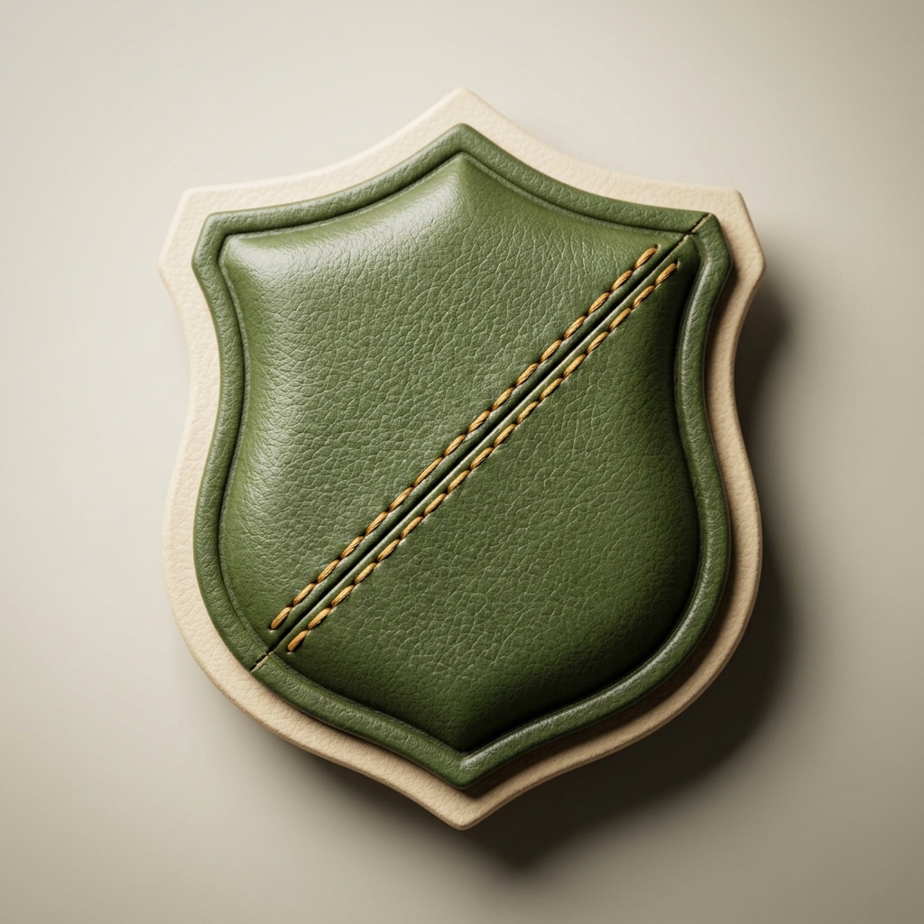
Avocado & cream, no center dot, saddle-stitch seam — the photoreal version of the direction already chosen from the vector work above.
Mark
A shield — a classic crest shape — crossed by a single dashed seam. It reads as a mark of standing before it reads as upholstery, which is the point: the shield says "vetted," the stitch says what's being vetted.
Do
Keep clear space around the mark equal to the shield's own width. Use it at 24px or larger. Let it sit on a flat surface token (bg or surface).
Don't
Don't stretch the shield off its proportions, recolor the seam outside the accent token, or place it over busy photography without a solid plate behind it.
Color
Good / warning / critical are status colors for job states — they're never used as the brand accent, and the accent is never used to mean a status.
Type
Fraunces carries the craft without leaning on a cliché serif-and-cream palette — it stays on headlines only. Numbers that matter (payouts, IDs, dates) are always set in the mono face so they read as data, not prose.
Voice
Name the standard, not the slogan.
"Quality-checked against our published spec" beats "quality you can trust." Say what was actually checked — and spell out quality assurance (QA) rather than leaning on the acronym.
One accountable name.
The UU is always the one answering for a job, even though a registered shop did the work. Copy never passes that off.
Numbers over adjectives.
"$340 payout, disclosed before you accept" beats "fair pricing." If a claim can be a number, make it one.
Trade-literate, not folksy.
Speak to a shop owner the way one tradesperson speaks to another — direct, specific, no forced warmth.